Kitab — derived from a shared word between various languages meaning "book" — started in 2021 when Ahmed and his wife Asma had the simple desire to open a bookstore with a self-serve coffee station in Hamtramck. They weren't always passionate about reading, and they struggled to find literature that met them where they were, so they set out to build the community they were looking for.
Their modest dream transformed into a profound mission: a dedicated space for Islamic literature, a homely environment to read, work, and meet new people. Coffee became the lifeblood of the operation. Sandwiches became their signature. We built the brand that could carry all of it.
The challenge
Deliverables
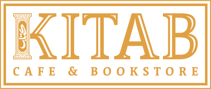
"The logo combines abstract Arabic calligraphy, ornamental design, and custom English typography — intentionally detailed, meant to look almost like an old newspaper headline or hand-written logo."
Planting Seeds · Kitab Brand Guide 2024Main logo — gold on dark
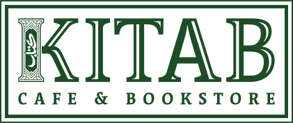
Dark logo — green on light
Beige logo — on black
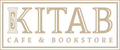
Black logo — on beige
Icon — K mark
For subtle branding — coffee cups, social profile picture
Book spine

Even more subtle — where space is very limited
Logo elements
 +
K
+
FRAME
+
K
+
FRAME
Arabic calligraphy + K letterform + ornamental frame
Vibrant pairing
Green + Yellow — for store fronts, social media, and primary brand moments
Subtle pairing
Black + Cream + Beige — for a quieter, more refined look
Headings
Oswald Medium
Titles, slogans, video
Body
Mr Eaves San OT
Regular & Bold — main body font
Alt body
Acumin Variable
Menu and alternate use
Logo type
Acuta Medium / Bold
Logo only — modified for "KITAB" wordmark
Frame — gold fill

Use with the borderless logo — for social media posts and print collateral
Frame — outline
Lighter version for use on cream or white backgrounds
Usage notes
When using the frame, use the borderless logo. If using the spine, align it to one side, slightly cut off, and align the content to the opposite side. Use either the border or the spine — not both. Avoid overlapping the logo, Kitab Arabic text, or the spine against one another.
Logo variations for different contexts
Colour versions — gold, dark, monotone
Community-first design for Hamtramck & beyond