The Michigan Institute of Sacred Knowledge was created to provide opportunities for people to study the sacred sciences, regardless of age, gender, location, availability or personal responsibilities.
Its educational programmes are grounded in the Qur'an and Sunnah, transmitting authentic Islamic scholarship from teacher to student while making classical learning accessible to the different layers of modern society.
The new identity brings together academic authority, traditional Islamic visual language and a welcoming, contemporary design system. It positions MISK as both a custodian of sacred knowledge and an open pathway into it.
The challenge
Deliverables
Primary logo — blue on warm cream
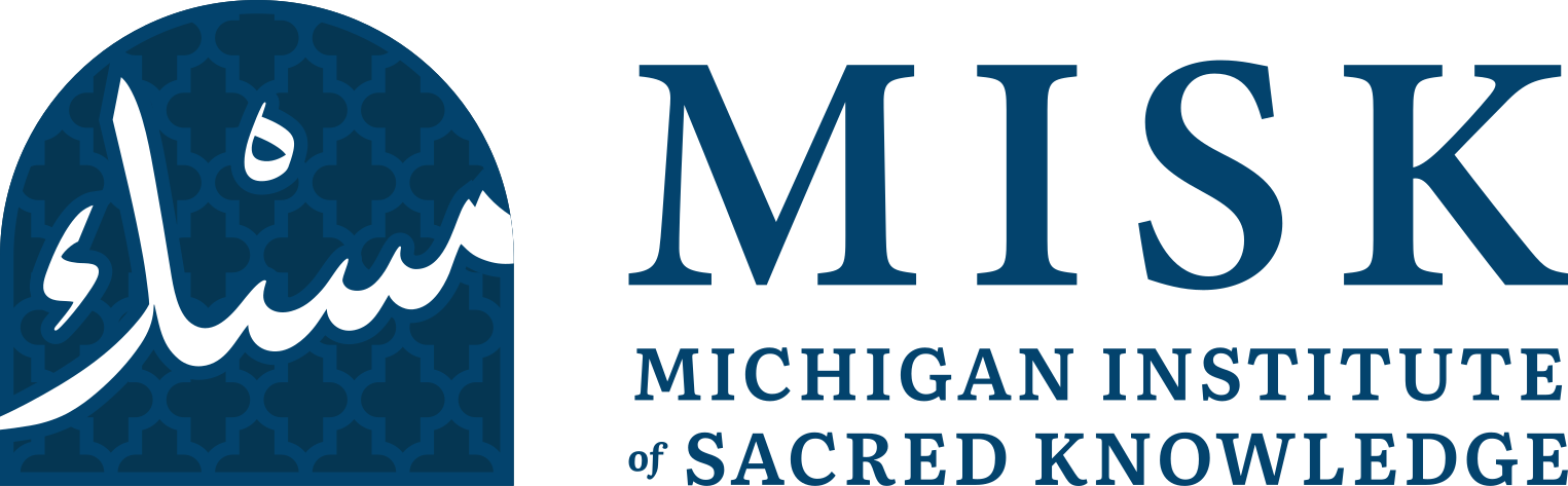
The primary logo combines the Arabic icon with the complete institutional wordmark.
Alternate logo composition
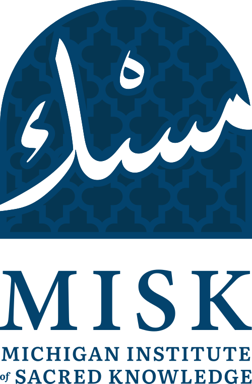
An alternate composition designed for layouts requiring a more compact or vertically balanced presentation.
The rounded enclosure recalls Islamic arches, gateways and the architectural spaces traditionally associated with learning.
The Arabic name forms the centre of the mark, anchoring the identity in Islamic tradition and the transmission of sacred knowledge.
The repeating geometry represents continuity, structure and the interconnected nature of learning, scholarship and community.
Patterned version
The complete icon with the Islamic geometric pattern embedded into the arched form.
Solid version
A simplified solid mark for smaller sizes and applications where the detailed geometric pattern may lose clarity.
Usage guidance
Primary palette
Supporting shades
Deep shades
Secondary accents
Usage proportions
Main and secondary colours should occupy approximately 80% of each design, with tertiary and accent colours accounting for the remaining 20%.
Headings
Literata
Regular · SemiBold · Bold · Black
Titles & display
Opulent
Used for expressive titles, slogans and video
Body font
Plus Jakarta Sans
Light · Regular · SemiBold · Bold · Black
Logo wordmark

The MISK wordmark uses a classical serif construction with generous tracking, giving the institution a formal and scholarly presence.
Institutional subheading
Literata SemiBold supports the primary name and gives the institution an academic, authoritative quality.
Main pattern — blue on cream

A modular Islamic geometric system used across backgrounds, educational materials, packaging and digital applications.
Main pattern — tonal blue
A restrained tonal treatment for premium applications where the pattern should add depth without dominating the content.
MISK calligraphic repeat
The Arabic wordmark is transformed into a continuous decorative asset, reinforcing the identity through repetition.
Calligraphic pattern — dark application
Suitable for branded environments, presentation backgrounds, social content and institutional print materials.
Logo configurations for print and digital
Core and supporting brand colours
Expandable pattern systems
Complementary typography families